Working in a SIEM (Security Information and Event Management) tool all day can be dull. Platform designers often prioritize data to facilitate decision-making, overwhelming SOC analysts with information hindering their focus. In web design, subtle choices can impact how users interact with a web page. Visual cues help identify the essential information relevant to an alert.
Here's how Microsoft Sentinel users can add visuals to security incident descriptions, plus a few examples.
| ⚠️ NOTE: Microsoft probably didn't intend for users to modify Sentinel incident descriptions using the methods below, so be mindful that this ability may not always exist! |
Overview
SIEM platform designers make an incredible effort to ensure that the most critical data is readily available in the UI, but you can only sometimes please everyone. Whenever I work with someone new to a SIEM, they can be overwhelmed by the information presented. One of the first questions is usually: "What do I need from all this stuff to close this alert?". I almost always get complaints wishing certain interface elements were more prominent, placed in a different location, etc. Luckily, there are usually some tricks that SIEM engineers can implement to alleviate these issues.
Most Microsoft Sentinel content developers probably know that incident comments allow for some customization besides plain text, such as HTML tables and playing font styling. However, this also applies to the incident description itself! This prioritization is critical as it takes fewer clicks for an analyst to see the incident description than to view all incident comments. This blog post examines several examples illustrating how a SOC operator can visually enhance incident descriptions.
Things you can't do
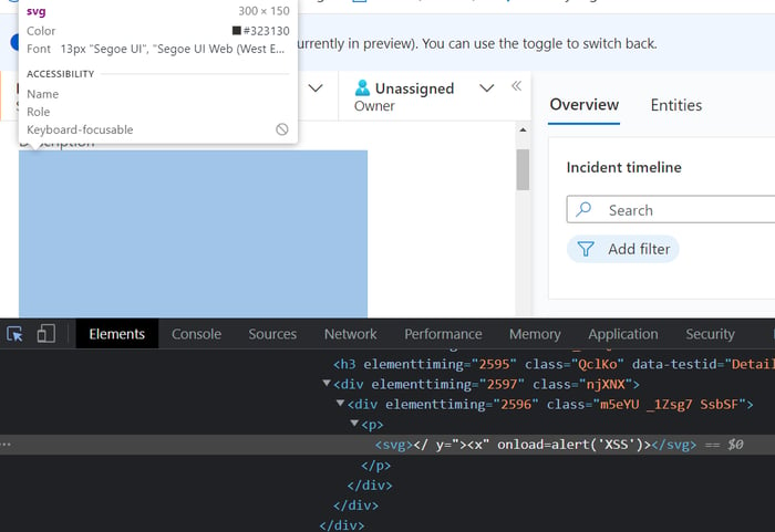
Unsurprisingly, a good amount of input filtering occurs when modifying an incident description. For example, injecting any JavaScript into the description field seems impossible. Additionally, certain elements, such as tables, end up using Azure's stylesheet, so keep that in mind if the final product looks a little different than expected.
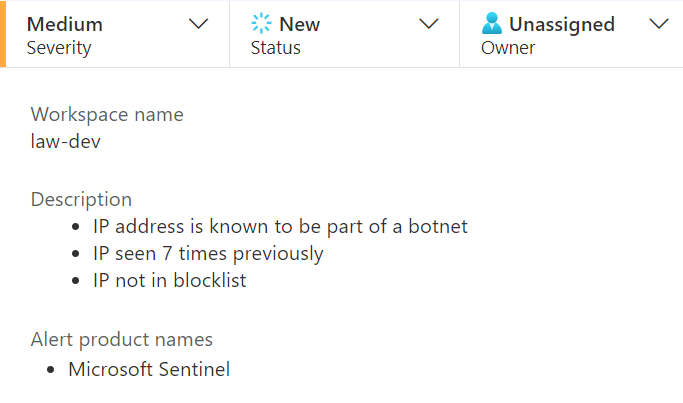
Example 1: Basic HTML
Basic HTML tags work in the description field. A use case I've had success with is adding a list with additional enrichment data:
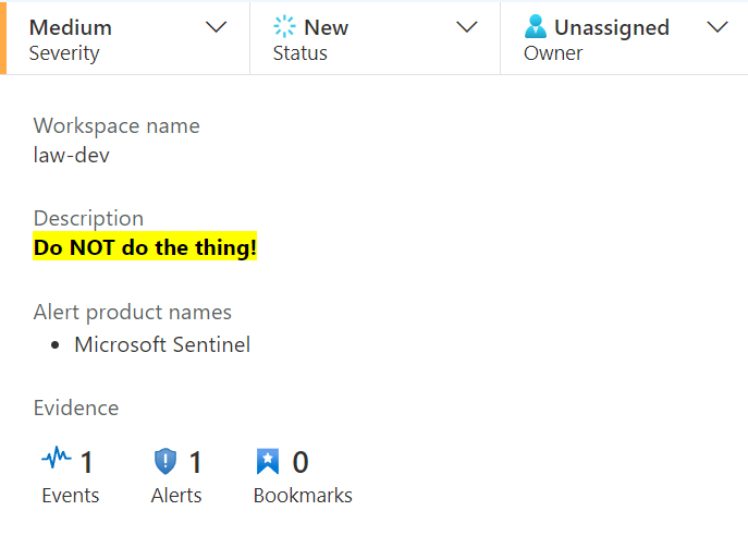
Another good example would be the <strong> and <mark> tags to make something really obvious:
Finally, using the <details> tag is a great way to hide details:
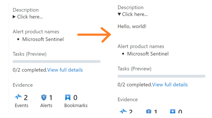
Example 2: Add TLP banners
Many SOC teams utilize the Traffic Light Protocol (TLP) to classify the sensitivity of specific security incidents. Unlike other SIEM platforms, Microsoft Sentinel offers no UI elements describing TLP classification. Usually, the workaround is adding tags to a security incident, but tags can also be challenging to find without scrolling around the page. When opening the incidents menu, the tags column is out of view by default in both the queue and incident details blade:
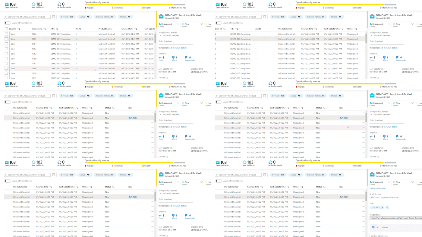
Adding a TLP banner to the incident description is one way to ease this process. Using some basic HTML styling provides a nice color-coded banner to the description:
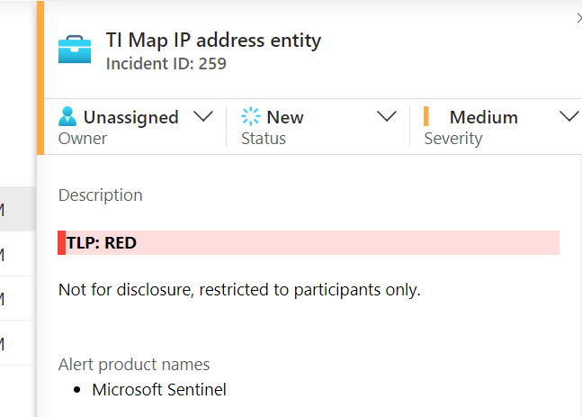
HTML used here:
<div style="background-color: #ffdddd;border-left: 6px solid #f44336;"></p style="padding-left: 5px"><strong>TLP: RED</strong> </p></div><p>Not for disclosure, restricted to participants only.</p>
Check out this playbook, which automatically generates TLP banners for your Microsoft Sentinel incidents.
Example 3: Risk score bar
Using a risk-scoring methodology can help analysts determine triage priorities. Microsoft Sentinel lacks UI elements for risk scores, unlike the Microsoft 365 Defender portal. Similar to the previous example, this value typically gets assigned to a tag. Adding a simple progress-bar style element can quickly catch an analyst's eye.
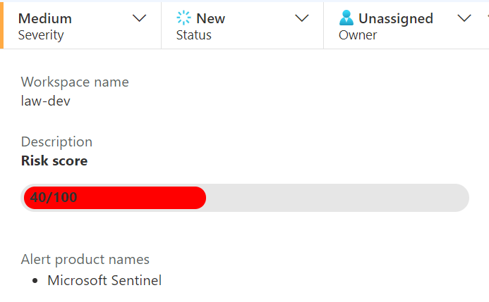
HTML used here:
<div style="background-color: #e6e6e6;border-radius: 13px;padding: 3px;"><div style="background-color: red;width: 40%;height: 20px;border-radius: 10px; padding-left: 10px">40/100</div></div>
Example 4: Add images and SVGs
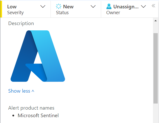
This final example is less practical but could lead to some fun ideas. Adding images and Scalable Vector Graphics (SVGs) is possible.
Conclusion
This post reviewed a few examples of how to dress up the incident description field in Microsoft Sentinel with more than just plain text. Let us know if you've used this to your advantage and have other examples you'd like to share!
Explore RL's Spectra suite: Spectra Assure for software supply chain security, Spectra Detect for scalable file analysis, Spectra Analyze for malware analysis and threat hunting, and Spectra Intelligence for reputation data and intelligence.


